Background
Petrichor Organics began as a sustainability-focused venture under GoodEarth. The brand had already done the hard work—reviving degraded land into a thriving regenerative farm in Hunnigere—but the store's identity didn’t quite tell that story. The mission was ambitious: restore soil, ecosystems, and how people consume food. Yet, to most customers, Petrichor still looked like just another organic store.When Petrichor approached us at Studio Sorted, their ask was clear: help them communicate their deeper purpose. Not with long-winded explanations, but through a brand identity that would make people feel it instantly. The goal wasn’t just better branding—it was alignment. Of values. Of vision. Of voice.

Strategy
We started by clarifying what Petrichor really stood for. This wasn’t a brand looking to ride the wave of sustainability trends—it was one with genuine, on-ground impact and a long-term regenerative mission. One of our strongest creative intentions throughout the process was to steer as far away as possible from the prevalent trend of greenwashing. We wanted to avoid the superficial and formulaic language, visuals, and tropes often used to portray 'sustainable' initiatives that barely scratch the surface.
We made it a point to design a brand that wouldn’t just look sustainable—but feel real, grounded, and earned. Yes, Petrichor sold fresh produce. But the real story lay in how that produce was grown—through regenerative practices that revived the land and protected ecosystems. We crafted a strategic shift that positioned Petrichor not just as a place to buy food, but as a living, breathing ecosystem brand.
The new identity needed to speak to an audience that cared—about the soil, the planet, and the choices they made. We anchored the narrative around one clear line: "We grow food that restores the planet instead of destroying it."
This became more than just a message. It became the backbone of the brand’s tone, design, and experience.

Verbal Identity
We developed a verbal identity that was confident, grounded, and easy to connect with. Petrichor’s new voice is rooted in science but never cold; it informs without overwhelming. It doesn’t lecture—it invites.
We kept the language factual and empowering. Copy lines like "You are what you Earth," "One Soil. For All," and "Who knew activism could be this cool?" found their way into packaging, social posts, and signage. Together, they helped shift Petrichor from being a place that sells to a brand that speaks.
Every word was placed with care—to educate, inspire, and include. One of the core phrases that we kept intact throughout this process was the brand's guiding tagline: Safe, Sustainable, Responsible.
These three words encapsulate Petrichor’s values—ensuring their practices are rooted in safety for people and planet, driven by sustainable principles, and carried out with accountability at every level. The tagline became a simple yet powerful way to anchor everything Petrichor stood for—appearing on storefronts, packaging, and digital platforms.. The tone is equal parts grounded and idealistic, always pointing toward something bigger than the product in hand.


Visual Identity
Visually, the rebrand was designed to feel rooted yet modern. Inspired by the tones of the soil and produce itself, we built a warm color palette with names like "Rice" and "Tomato."
From the beginning, we made a deliberate decision to step away from the typical 'organic' look. No overuse of brown kraft textures or generic green hues. Instead, we developed a fresh, optimistic palette that reflected our regenerative approach—grounded in nature, but expressive and contemporary. We wanted Petrichor to feel alive, not earthy in the clichéd sense, but in a way that evoked vibrancy, growth, and possibility.
The typography system was chosen for its clarity and adaptability, allowing Petrichor to communicate easily in both Kannada and English. Illustrative details hinted at biodiversity and natural systems without feeling overly decorative.
Packaging was kept clean and minimal. The intention was to let the produce speak—while subtle labels told stories of origin, soil health, and honest sourcing. Even the smallest container carried a bigger message.


Retail Experience
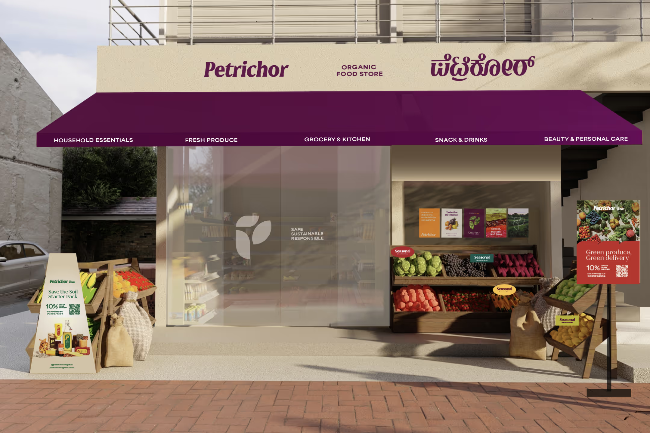
The Rajarajeshwari Nagar store in Bangalore became the first full expression of the new brand. We wanted it to feel less like a store and more like a space to reconnect—with land, food, and intention.
The signage featured both Kannada and English, reflecting the brand’s rootedness. Inside, wooden crates, minimal packaging, and open layouts created an earthy, inviting vibe. Information panels quietly educated visitors about regenerative agriculture, while QR codes linked them to videos from the Hunnigere farm.
Even the way staff interacted with customers shifted. Trained with the brand’s new tone in mind, they were now storytellers as much as service providers. From layout to language, the space was built to feel transparent, considered, and deeply human.


