SMASH GUYS BRANDING by studio sorted

Smash Guys

From name to napkin, Studio Sorted built the boldest burger brand in the city.

Scope
Naming
Brand Identity
Facade Design
Packaging
Logotype
Uniforms
About
Year: 2024-25
Status: WIP
Backed by the founder of The Pizza Bakery and Paris Panini, this burger brand was destined to make noise. Studio Sorted created everything—from the name and logo to the uniforms and persona. The result? A brand that hit hard, looked sharp, and became Bangalore’s next big obsession.
smash guys burger with custom branded butter papersmash guys uniform design by studio sorted
Branding Challenge: Smash Guys
When Abhijit Gupta—the founder behind cult favourites like The Pizza Bakery and Paris Panini—decided to enter the burger game, the expectations were sky-high. He wasn’t launching a menu item. He was launching a sensation. Our job: create a brand identity that would match the flavour, the energy, and the ambition.

In the great burger kitchen, there’s one thing constant - Smash.

A juicy grilled patty is smashed onto the soft golden bun. The layers after layers of perfection from gourmet veggies to rare cheese is smashed onto the patty. And finally, another glazed golden bun is smashed on top of everything for the final finish. When your burger is done, you smash it with your hands and squeeze while the cheese oozes out of it from every nook.
And when the taste is good, your eyes roll automatically as you smash your dish on the table to announce its perfection. There’s music to this loudness, the smash is inevitable when it's that good.

Smash Guys is about the best burger chefs coming together to make the finest gourmet smash burgers in town.
smash guys burger drop banner
Co-Creating with the Team
We sat down with the Smash Guys team, including founder Abhijit Gupta and key stakeholders, to co-create the core of the brand. One of the first major outcomes? The name itself—"Smash Guys"—was born out of that brainstorm. These sessions laid the foundation for a brand that was built on sharp thinking and shared ambition. One of the first major outcomes? The name itself—"Smash Guys"—was born out of that brainstorm.
smash guys branding process with teams
Researching the Greats
We wanted the brand to feel instantly familiar yet undeniably fresh. Our research took us deep into the burger culture of America, from the grit of 23rd Street Burger to the slow-motion visuals of Hamburger America. We studied what made these places iconic—not just their food, but their identity. That visual universe of hand-painted signage, tiled floors, and greasy perfection became the core influence in our strategy. Our goal: to reimagine that diner energy for a new-age, delivery-first Indian market.
studio sorted research hamburger americastudio sorted research in n out burgerstudio sorted research 7th street burgerstudio sorted research vintage burger jointsstudio sorted research shakeshackstudio sorted research sam'sstudio sorted research in n outstudio sorted research sam'sstudio sorted research sam'sstudio sorted research hamburger americastudio sorted research 7th street burger new york
Making It Loud, Making It Last
The classic American diner aesthetic shaped the DNA of Smash Guys. The hand-painted lettering style made its way into the brand type. The diner flooring? It became the print on the butter paper—an iconic cue that customers now associate with the Smash Guys dining experience. Each element was deliberately designed to turn indulgence into a ritual. The butter paper didn’t just hold the burger—it held the mood.

And the uniforms? Think diner staff from a parallel universe—bold, minimal, and unmistakably Smash Guys. Inspired by classic diner cuts and silhouettes, the uniforms were reimagined in the brand's colour palette to feel both nostalgic and fresh. Not costume. Character.Every detail—visual and tactile—reinforced the idea: this isn’t fast food. It’s a full-sensory event.

Every detail—visual and tactile—reinforced the idea: this isn’t fast food. It’s a full-sensory event.

The logo came in bold and heavy, with letterforms that felt made for neon. The colour palette—yellow, black, and white—was tuned for impact. On screens, in hands, and across physical space, the branding stood out. This was a visual identity made to linger. To spill. To stain in all the right ways.

Smash Guys speaks like the burger feels: messy, fun, and impossible to put down. The tone is cheeky and assertive, grounded in a confidence that says: you’ll come back for more. From packaging stickers to delivery copy, the voice was designed to be as memorable as the food.
smash guys branding assetssmasgh guys burger diner inspired brandingsmash guys uniform design bold iconic diner stylesmash guys uniform hatsmash guys butter paper design brandingsmash guys menu designsmash guys uniform design diner style
Global Influence, Regional Pride
One of the defining elements of the Smash Guys identity is its bold use of Kannada typography. We developed a custom treatment that sits proudly next to the English type—hyperlocal, yet never provincial. It echoes Bangalore’s cultural pulse while staying true to the brand’s street-smart tone.

This balance of diner-inspired Americana with regional type speaks to Studio Sorted’s broader creative approach: context is power. Across projects, we continue to explore regional adaptations as a tool for authenticity, and Smash Guys remains one of our proudest examples of that blend.
smash guys kannada logo with burgersmash guys facade design
Building (and Branding) in Public

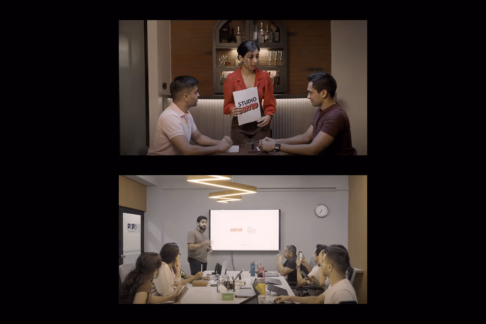
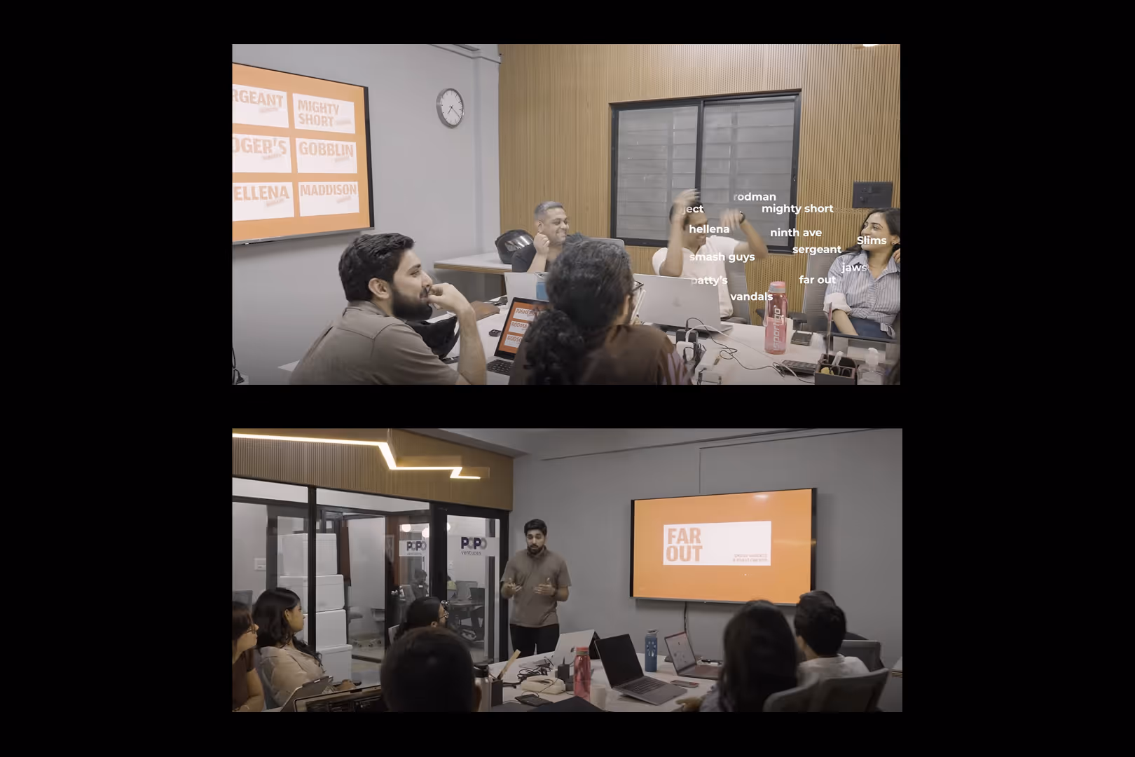
Smash Guys wasn’t just a launch—it was a live act. What made this brand special was how it invited the audience in. From Abhijit’s behind-the-scenes YouTube updates to shared brainstorming sessions, this project became a public build.

At Studio Sorted, we leaned into this open-door approach. Our design choices weren’t hidden away—they were developed with visibility, feedback, and community in mind. That alignment with the 'build in public' philosophy allowed the brand to gather momentum as it was being built. The audience didn’t just witness the brand coming to life; they felt part of it.

Burger Drop
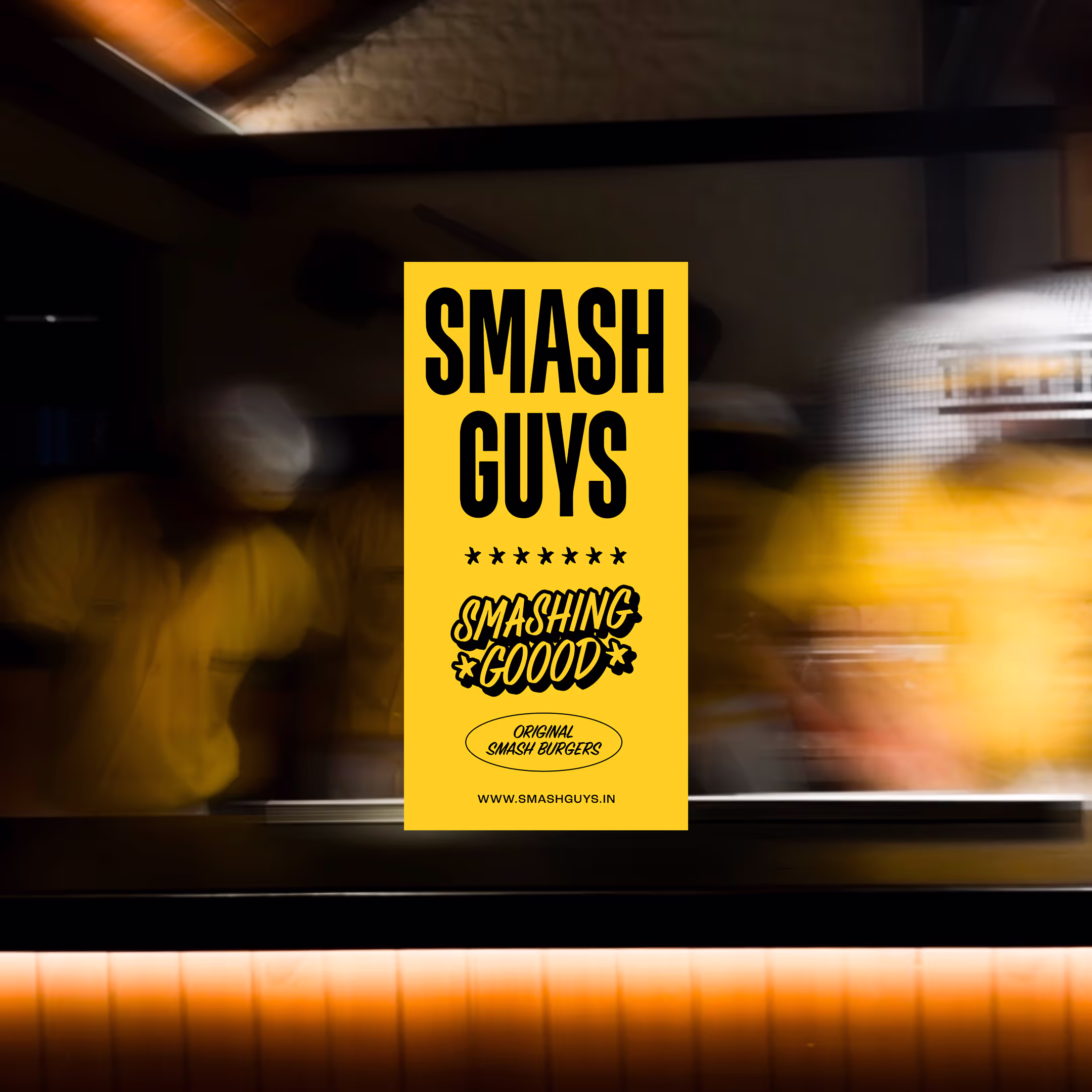
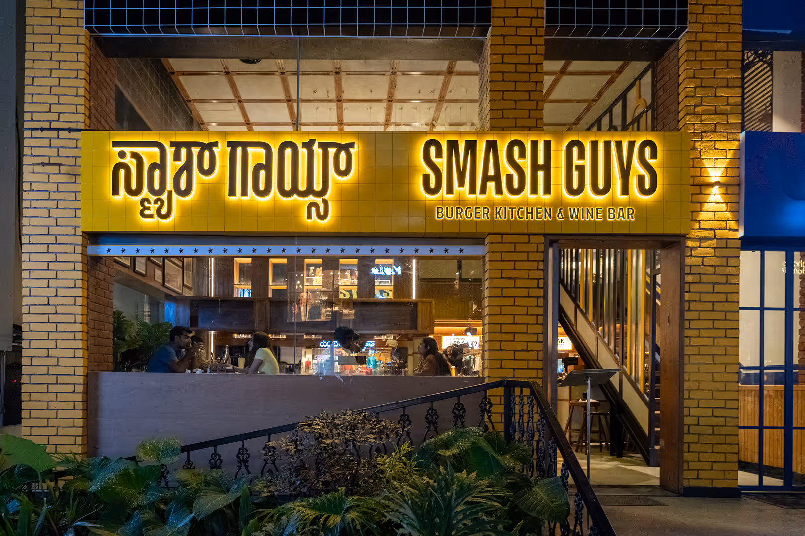
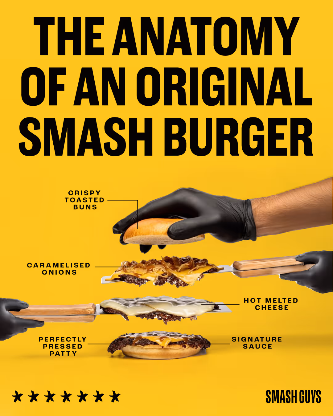
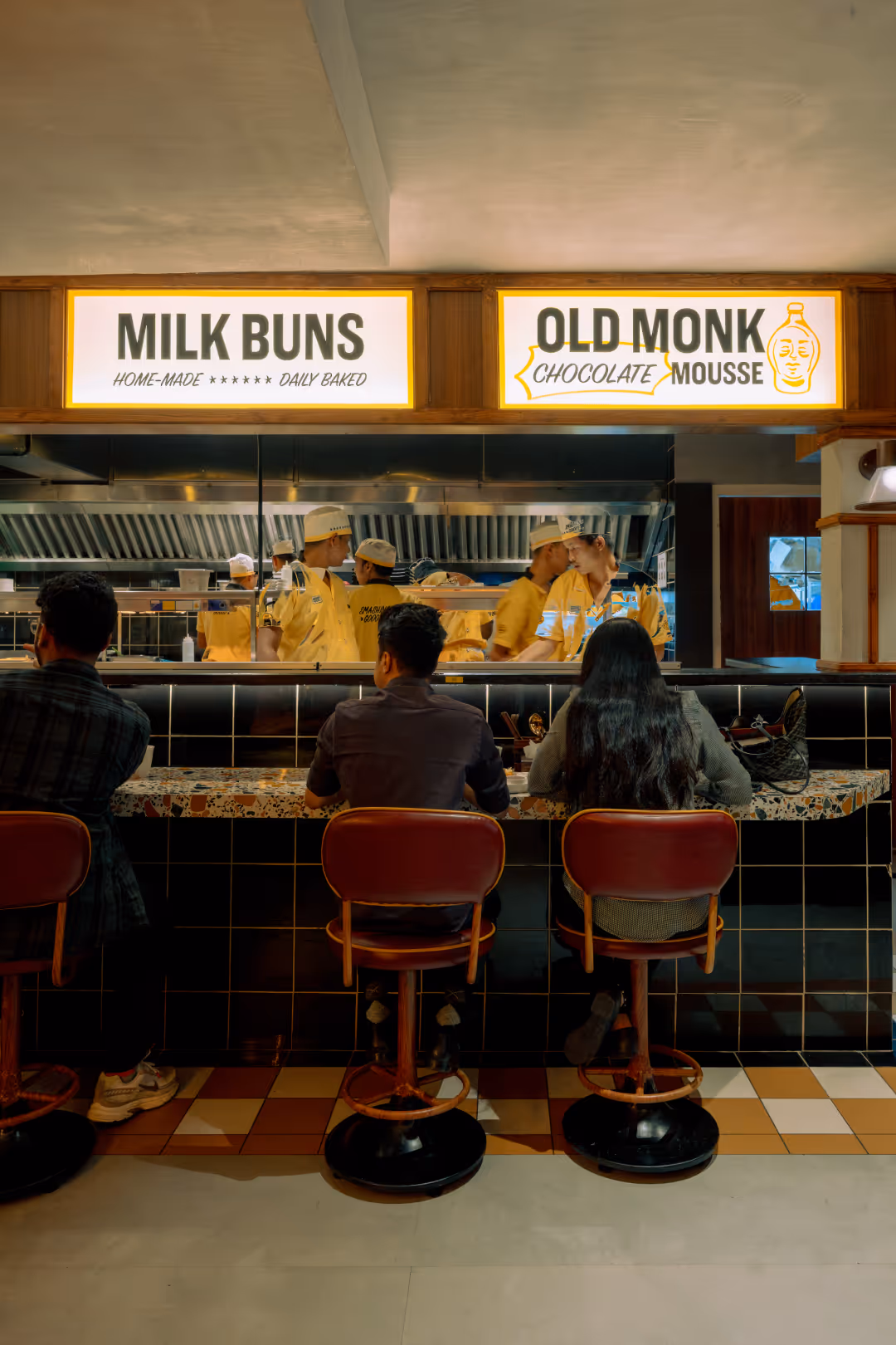
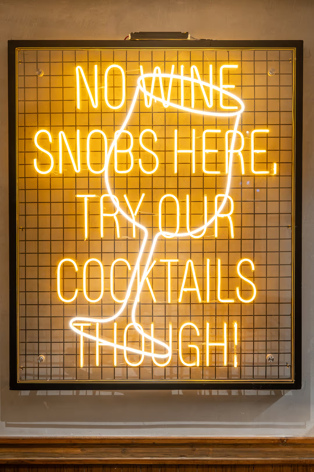
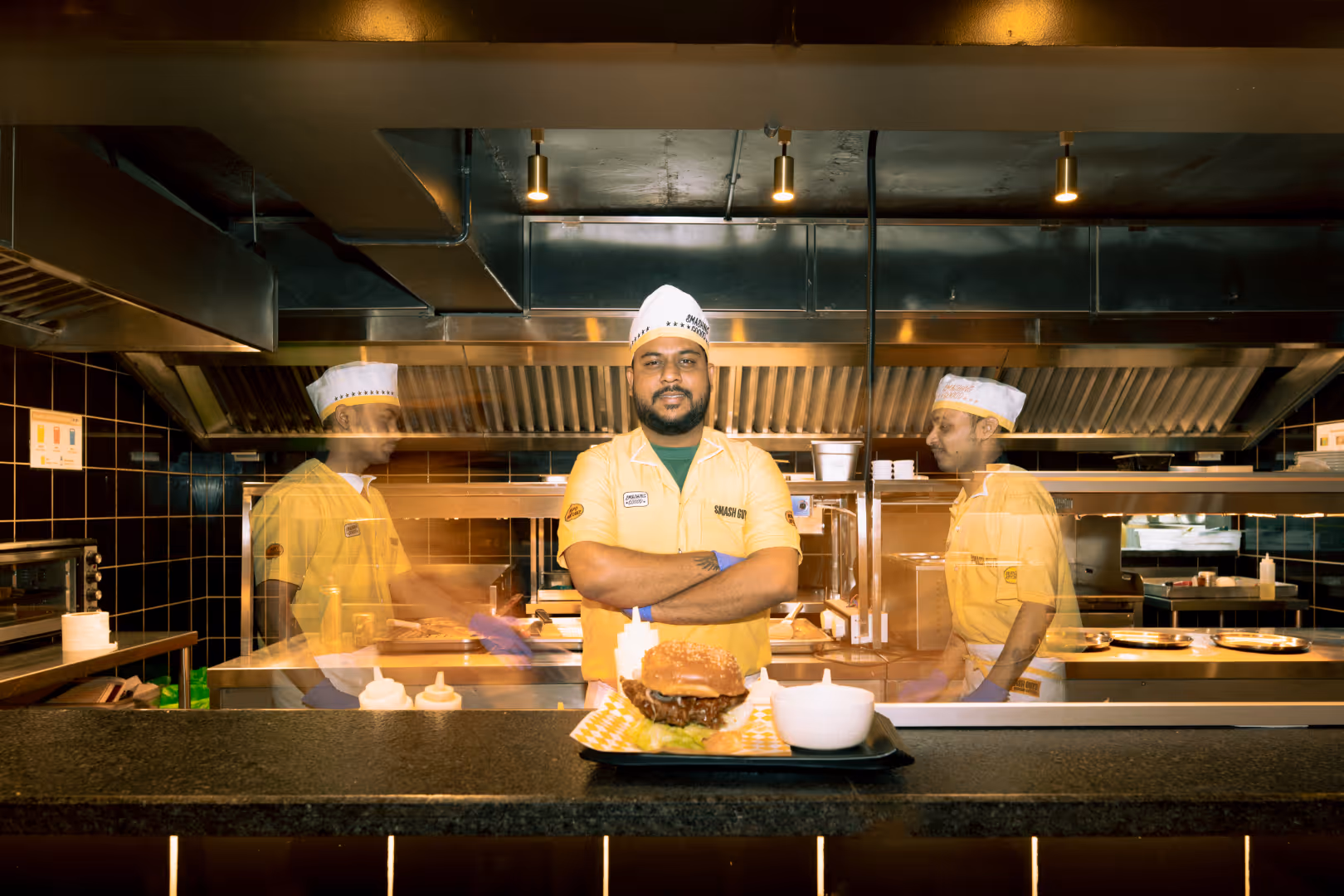
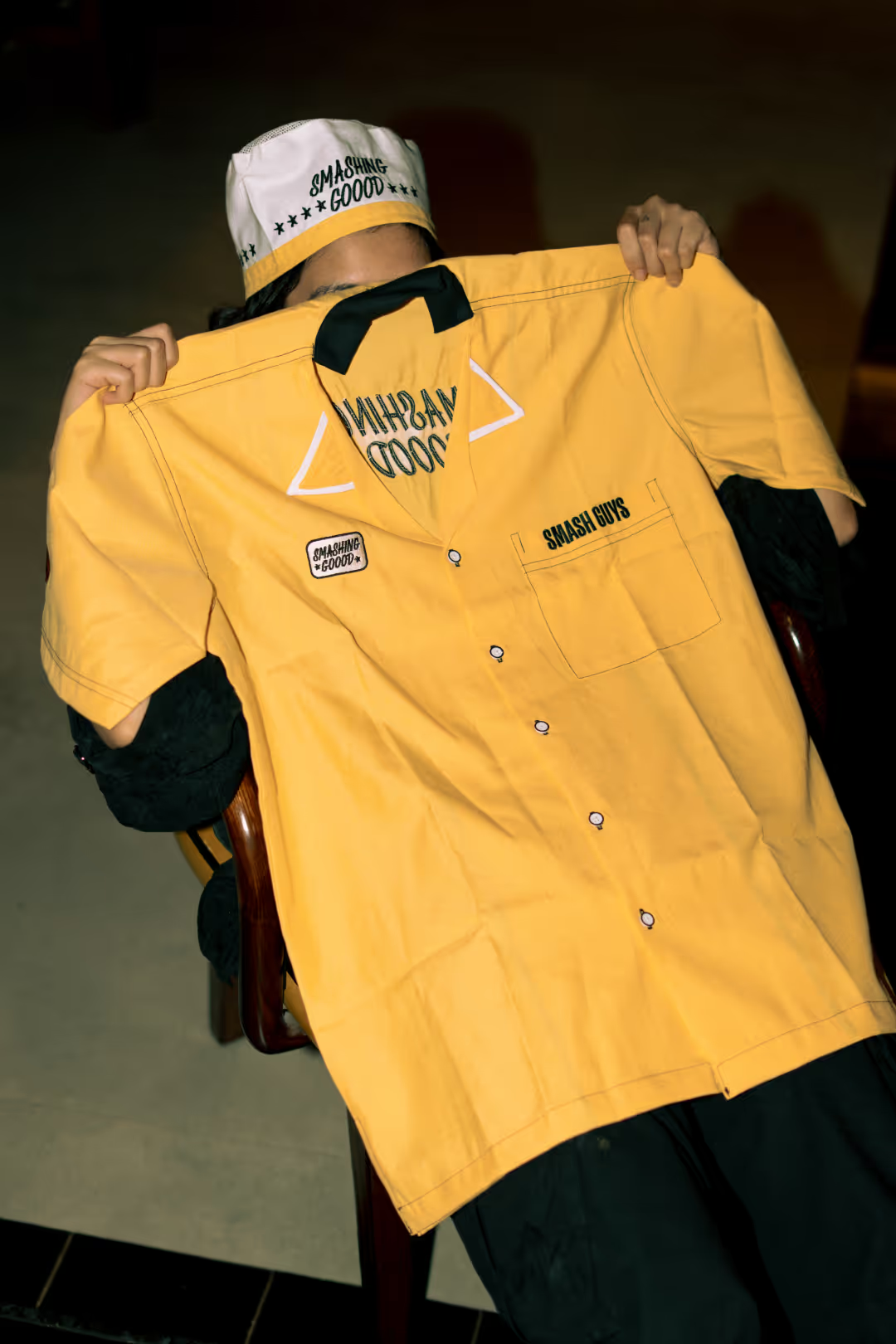
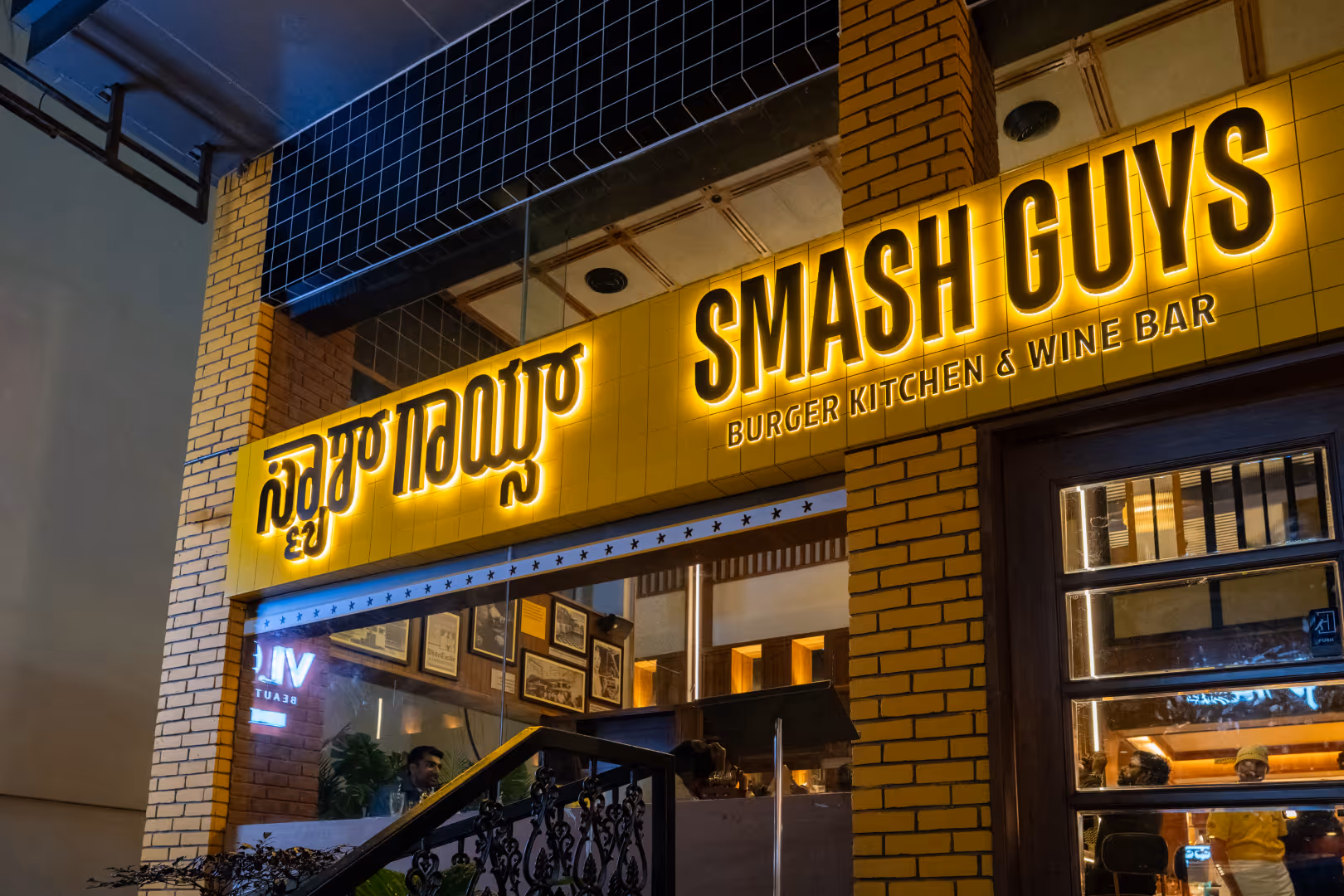
Studio Sorted’s work gave Smash Guys the presence—to dominate from day one.

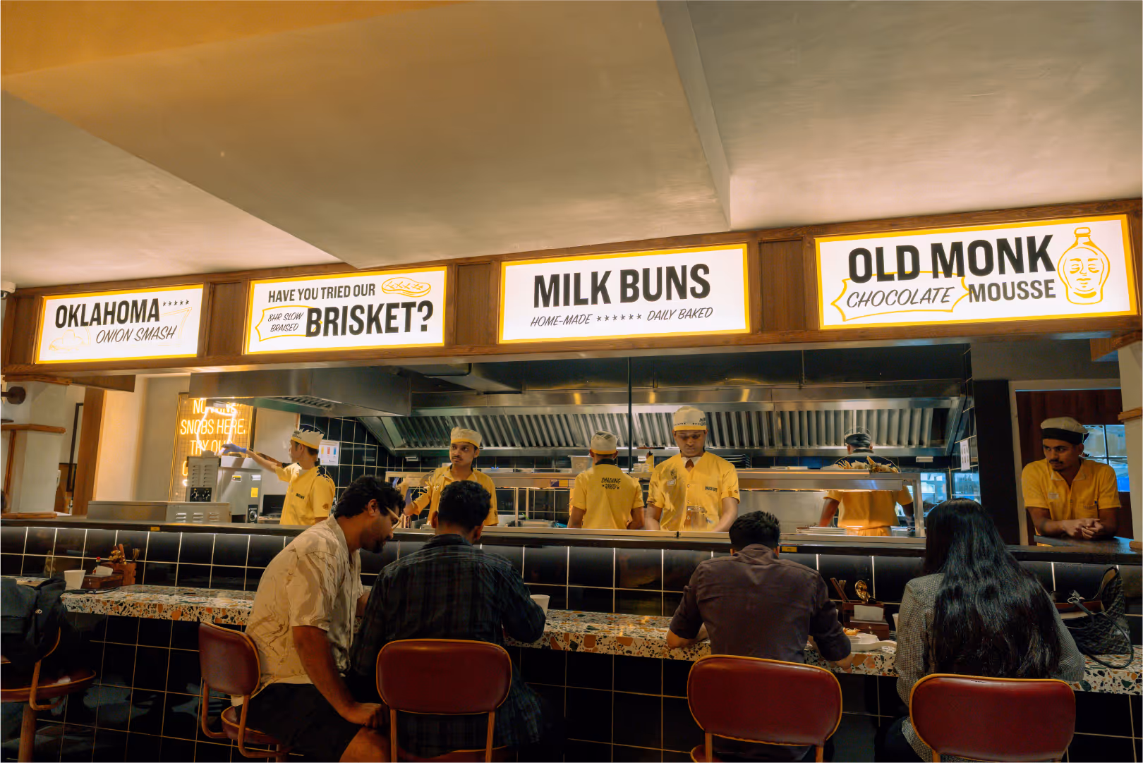
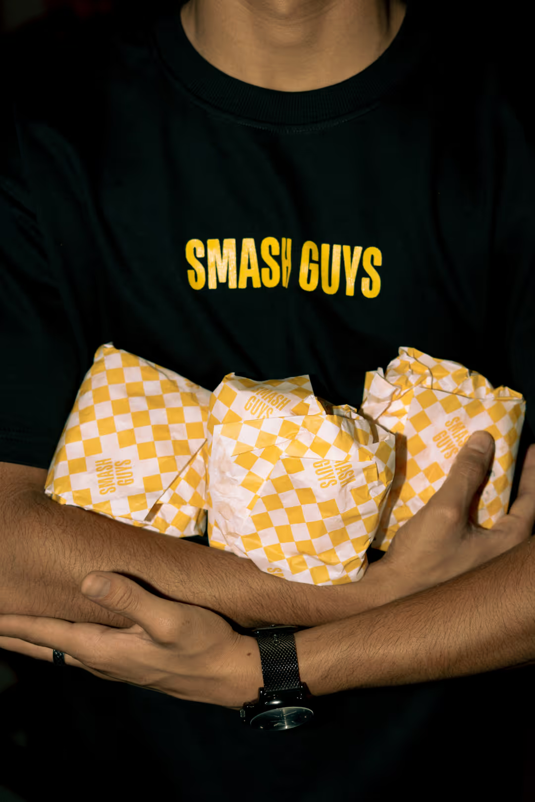
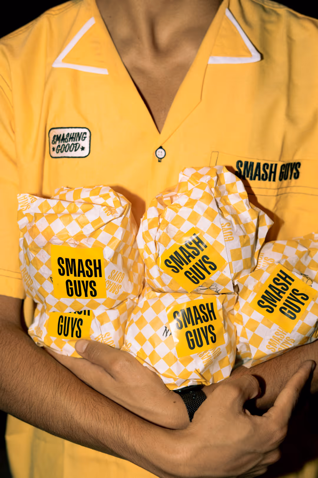
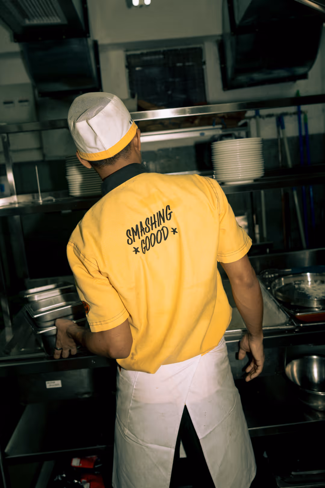
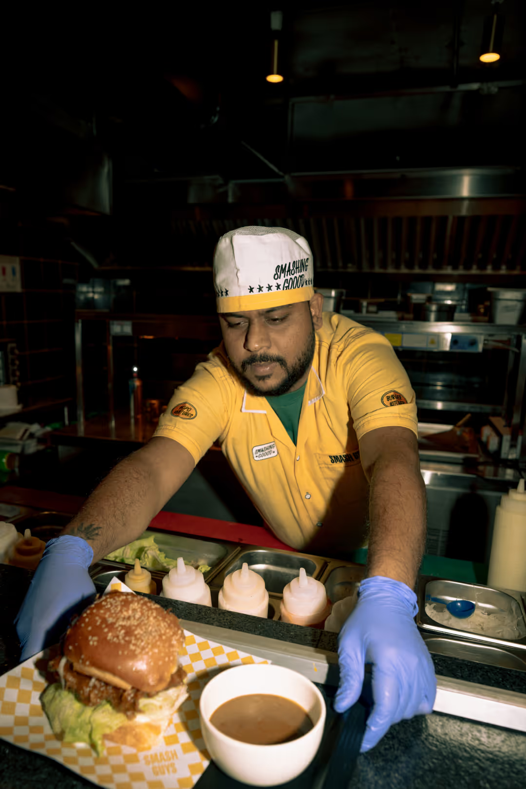
Smash Guys didn’t just launch—it arrived. It became one of Bangalore’s most talked-about burger brands within months. People queued. Swiggy orders spiked. Instagram turned into a playground of messy hands and cheesy smiles. The residency at Courtyard gave it even more street cred, but the real success was how fully the brand embedded itself into the city’s food memory. This was indulgence, bottled into a brand.

smash guys uniforms smash guys burger drop brandingsmash guys burger drop brandingsmash guys founder branding
Team

Type design: Anshul Gupta, Tanmay Acharya
Illustration: Tanmay Acharya
Copywriting: Kashish Choudhary
Creative direction: Abhishek Durani
‍Graphic design & Illustration: Anshul Gupta, Afeef Khan, Tanmay Acharya, Kushagra Banthia
smash guys meeting with studio sorted team
See more restaurant design projects →