Welly Belly
Branding for a healthy staple foods brand
Scope
Brand Strategy, User research Visual Identity, Packaging, Website Design
About
Year: 2024
Welly Belly is a modern FMCG brand redefining everyday Indian staples—making them healthier without changing how they feel, cook, or taste. Studio Sorted partnered from the ground up, crafting everything from the name and brand story to packaging, website, and strategy. The result? A gut-first brand built with science, culture, and unmistakable shelf presence.
The Brief
Welly Belly was born out of a simple truth: most Indians stress over occasional indulgences but overlook the everyday staples shaping their health. The brand set out to reimagine foods like flour, rice, and oils—making them genuinely healthier, without changing the taste or ritual of Indian meals.
Studio Sorted was brought on board from day zero to build the brand from scratch—name, narrative, packaging, website, and everything in between. The goal? To make Welly Belly stand out in a sea of “better-for-you” brands and reconnect Indians with the power of everyday eating.
Brand Strategy
Product Truth
Welly Belly delivers wholesome nutrition and everyday taste with real ingredients and no artificial additives.
02
Emotional Benefit
Allows consumers to make healthy choices, while enjoying food that feels familiar and satisfying.
04
01
UI and UX
We design meaningful and immaculate user experiences for the digital space. We specialise in communicating user interfaces with clarity and power.
Web design, app design, web development, UX research, motion design
Functional Benefit
A healthy, low-GI staple that offers versatility for both traditional recipes and modern dishes.
03
Fully Sorted
A space and name for curated self initiated projects that are rooted in our passion for interdisciplinary design.
Workshops, sessions, sketch-walks, showcases, documentation drives
Brand Purpose
Every day staples made healthy with Welly Belly. Empowering consumers to enjoy nutritious choices with the familiar taste of traditional staples.
Messaging Pillars
01
We are rhetorical
We are conversational
02
We don’t impose, we tell.
04
UI and UX
We design meaningful and immaculate user experiences for the digital space. We specialise in communicating user interfaces with clarity and power.
03
We challenge everyday norms and perception
Fully Sorted
A space and name for curated self initiated projects that are rooted in our passion for interdisciplinary design.
Workshops, sessions, sketch-walks, showcases, documentation drives
04
We are sure because we’ve done our homework
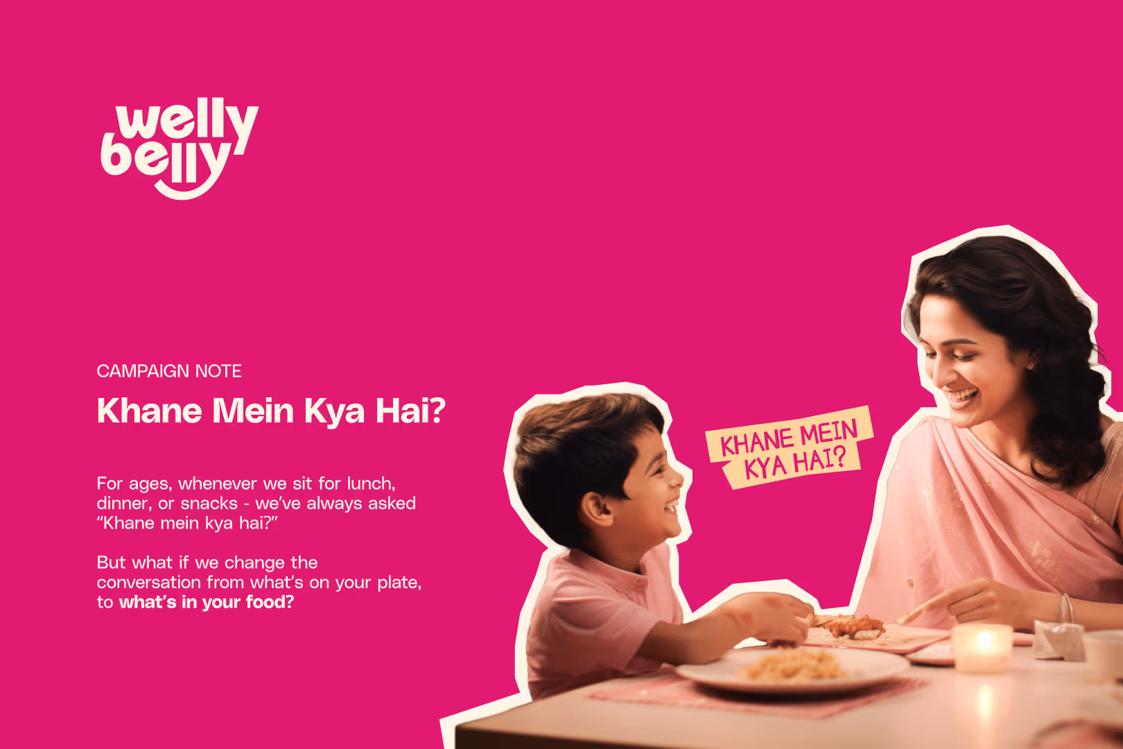
We started with strategy workshops that helped identify the emotional core of the brand: “Everyday staples, made healthy.” Welly Belly wasn’t here to preach or disrupt—it was here to improve what already works.
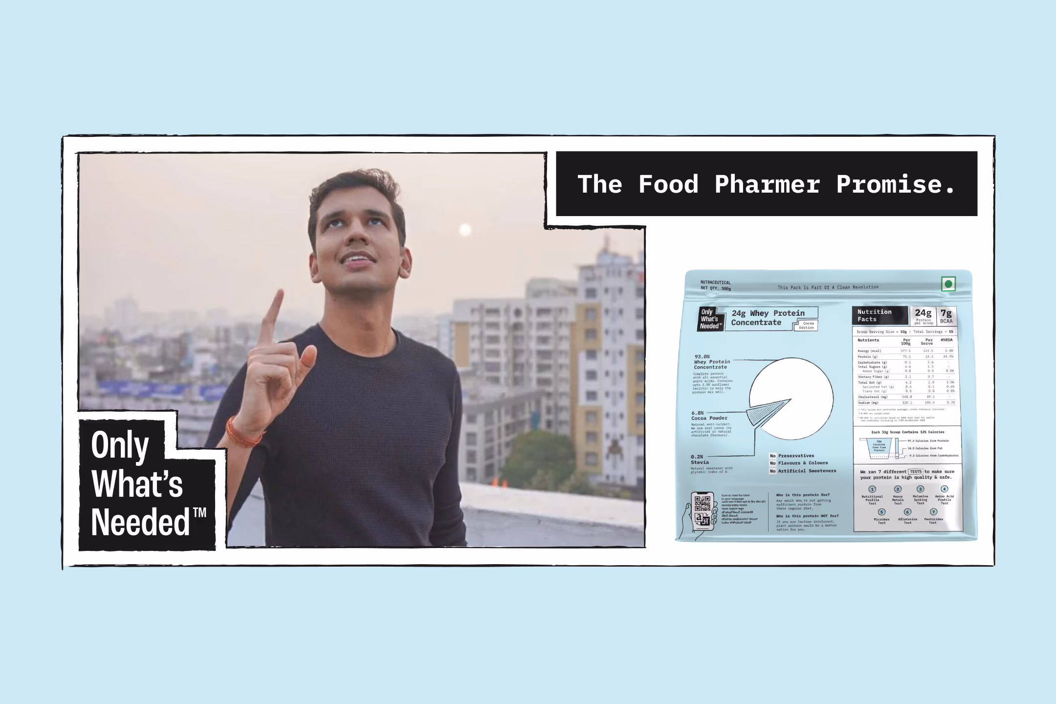
To keep the brand grounded in credibility, we brought in subject experts like Food Pharmer (Revant Himatsingka) to validate ingredients, claims, and messaging. This also ensured that Welly Belly spoke not just from passion but from the pulse of the nation.
The name Welly Belly struck the perfect balance—playful, memorable, and instantly clear. From there, we crafted a tone that was honest, approachable, and quietly confident. The kind of brand that educates you without lecturing, and makes you smile while doing it.
Welly Belly’s design system was built for clarity, flexibility, and unmistakable recall. At its core lies a strong visual logic: bold color hierarchy, modular type styles, and signature motifs like The Gut—a repeatable silhouette used across packaging, web, and print to hold benefits, illustrations, or facts.
We treated Staple Pink and Beige as the brand’s foundational neutrals—used like black and white—while accents like mustard yellow, leafy green, and sky blue were drawn directly from Indian ingredients to bring vitality and recognition across product categories.
The result is a design system that feels alive, intuitive, and distinctly Welly Belly—equally confident on a kirana shelf or Instagram story.

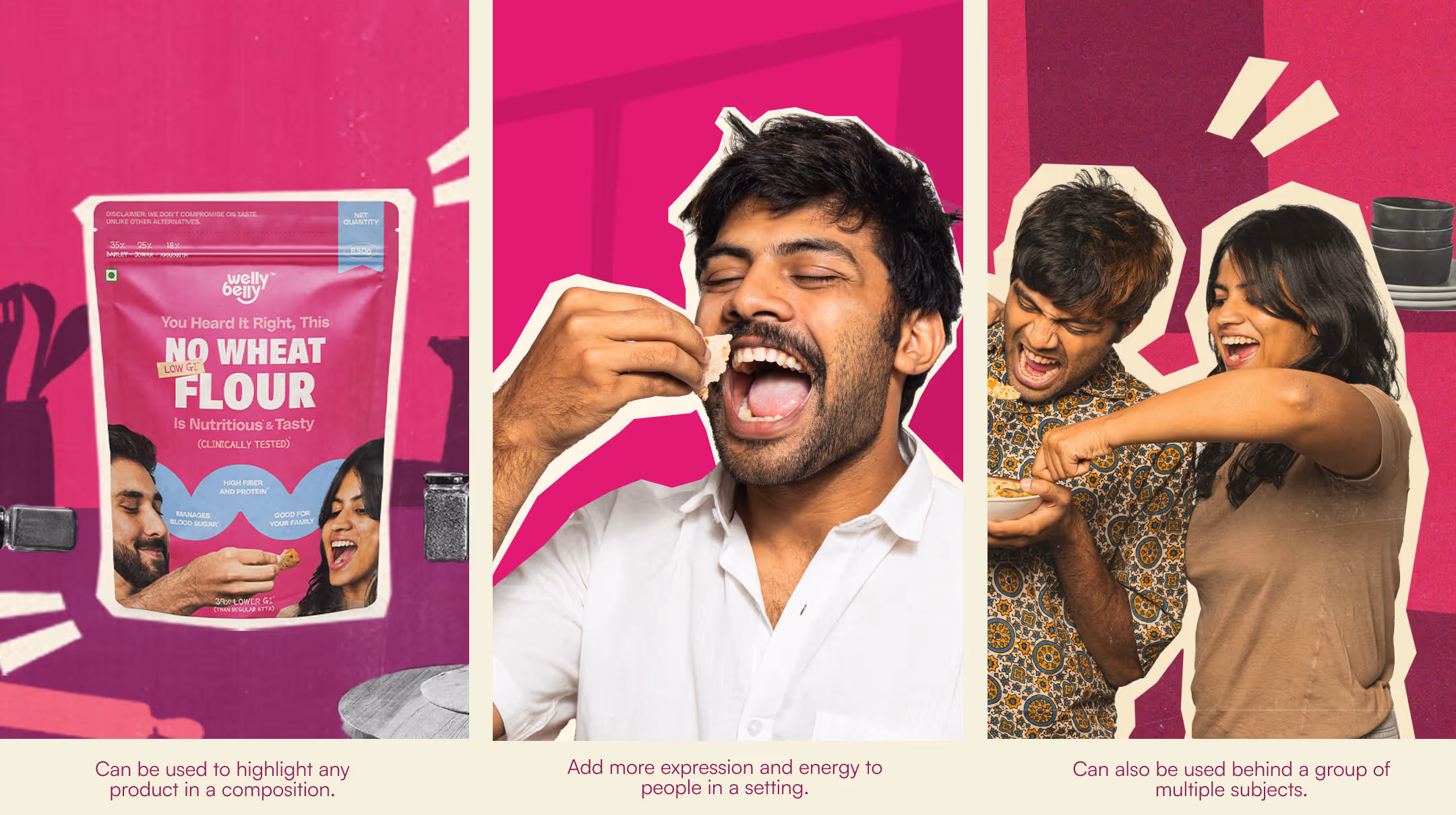
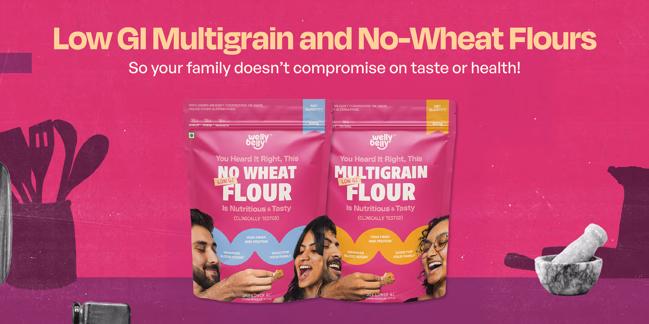
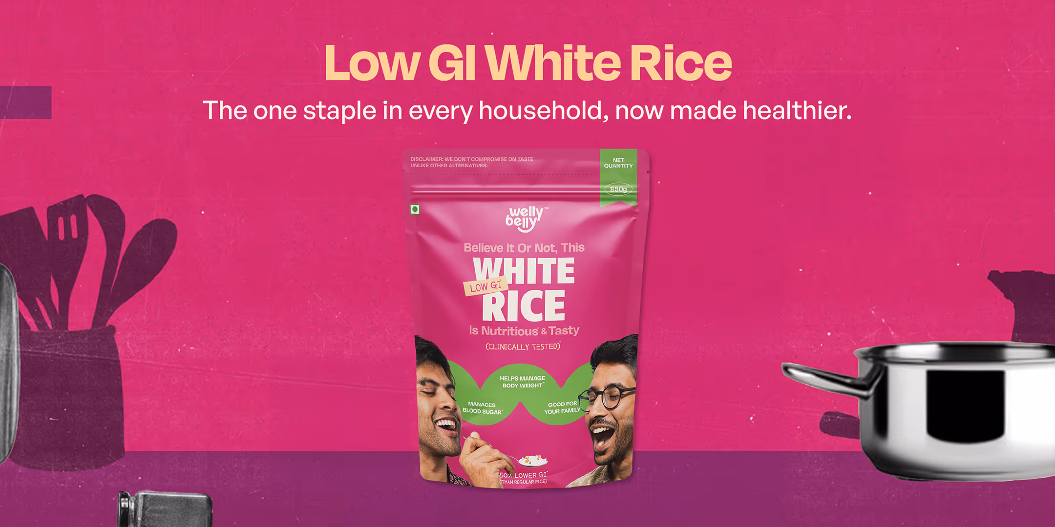
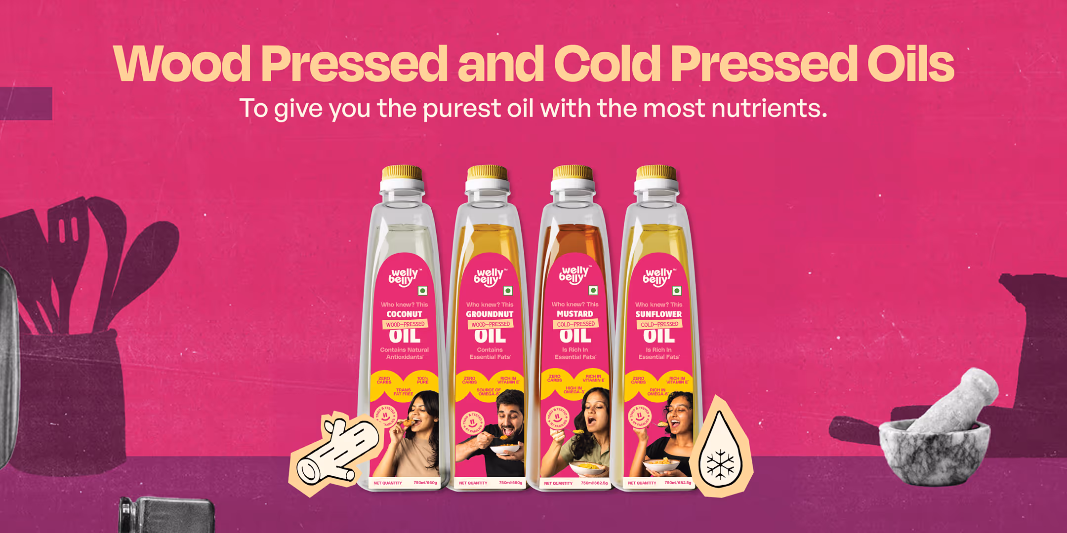
Welly Belly’s packaging was built to break the visual monotony of the staples aisle. We led with a bold pink—a deliberate departure from the greens and browns typical of health food—to signal freshness, familiarity, and joy. The layout balances trust-building claims (like “Low GI” and “Clinically Tested”) with a conversational tone that feels personal, not preachy.
We introduced “The Gut” as a signature graphic device—used to house benefits, icons, and facts—making the health-first promise visually consistent across all SKUs. Photography played a starring role: instead of idealized food shots, we featured real people (including our own team) enjoying real meals. This brought warmth, relatability, and a human touch to every pack.
Each design tells a clear story: what’s in the product, what’s not, and why it matters. No distractions. No jargon. Just honest, standout packaging that makes healthy feel good—and look good—at first glance.
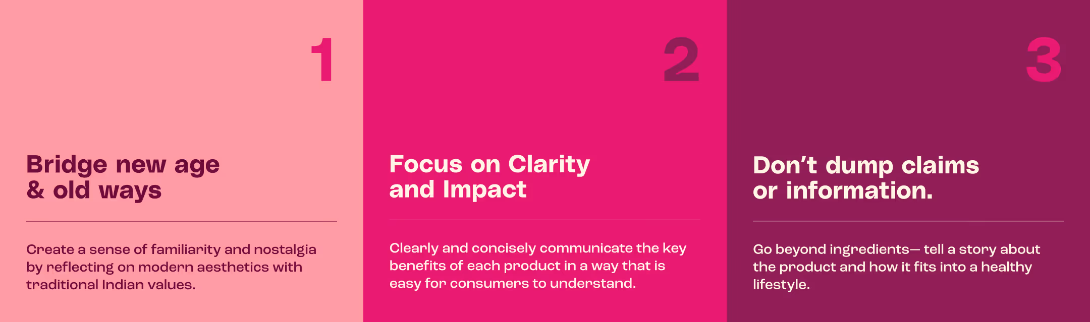
Principles of packaging:


Product categories:


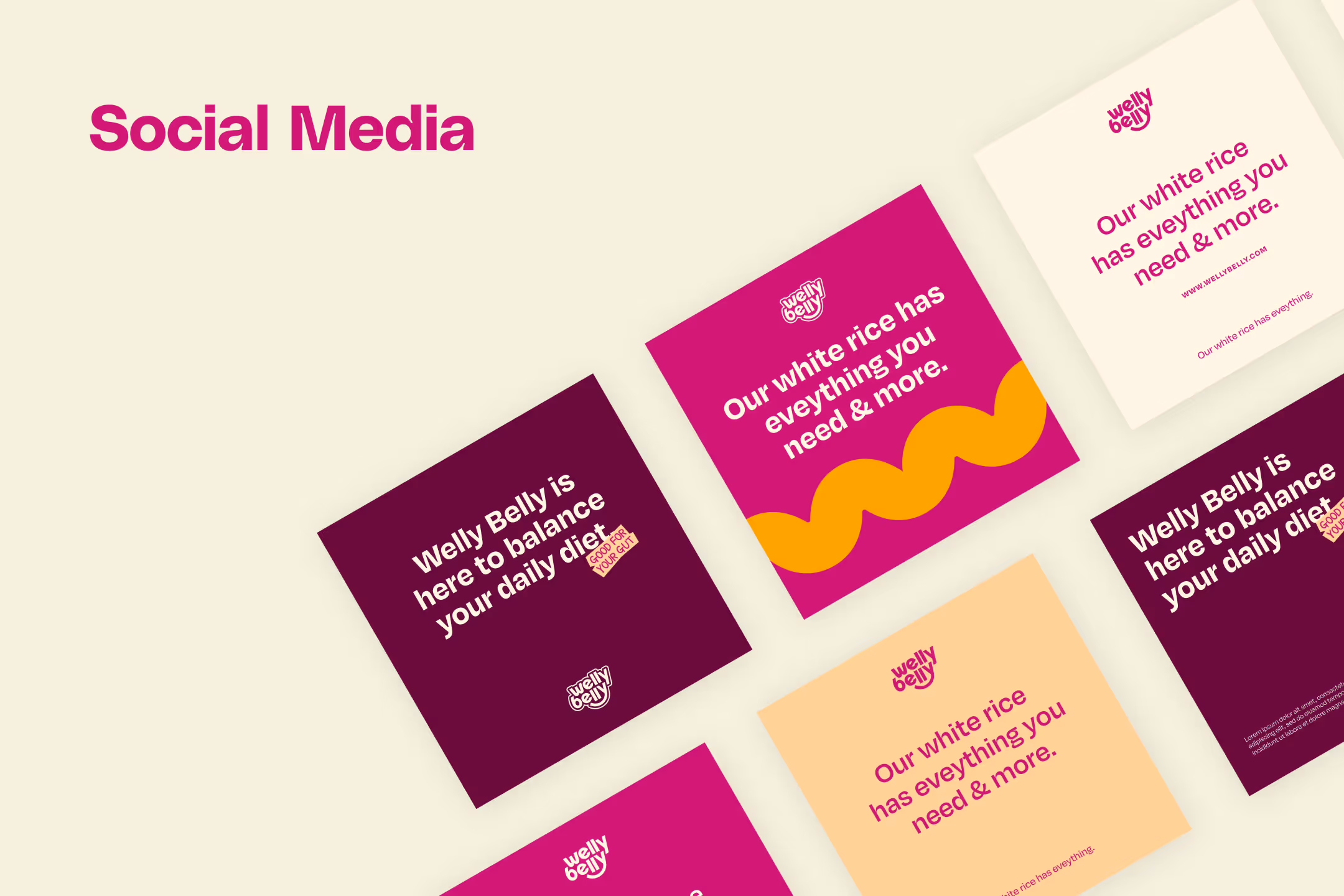
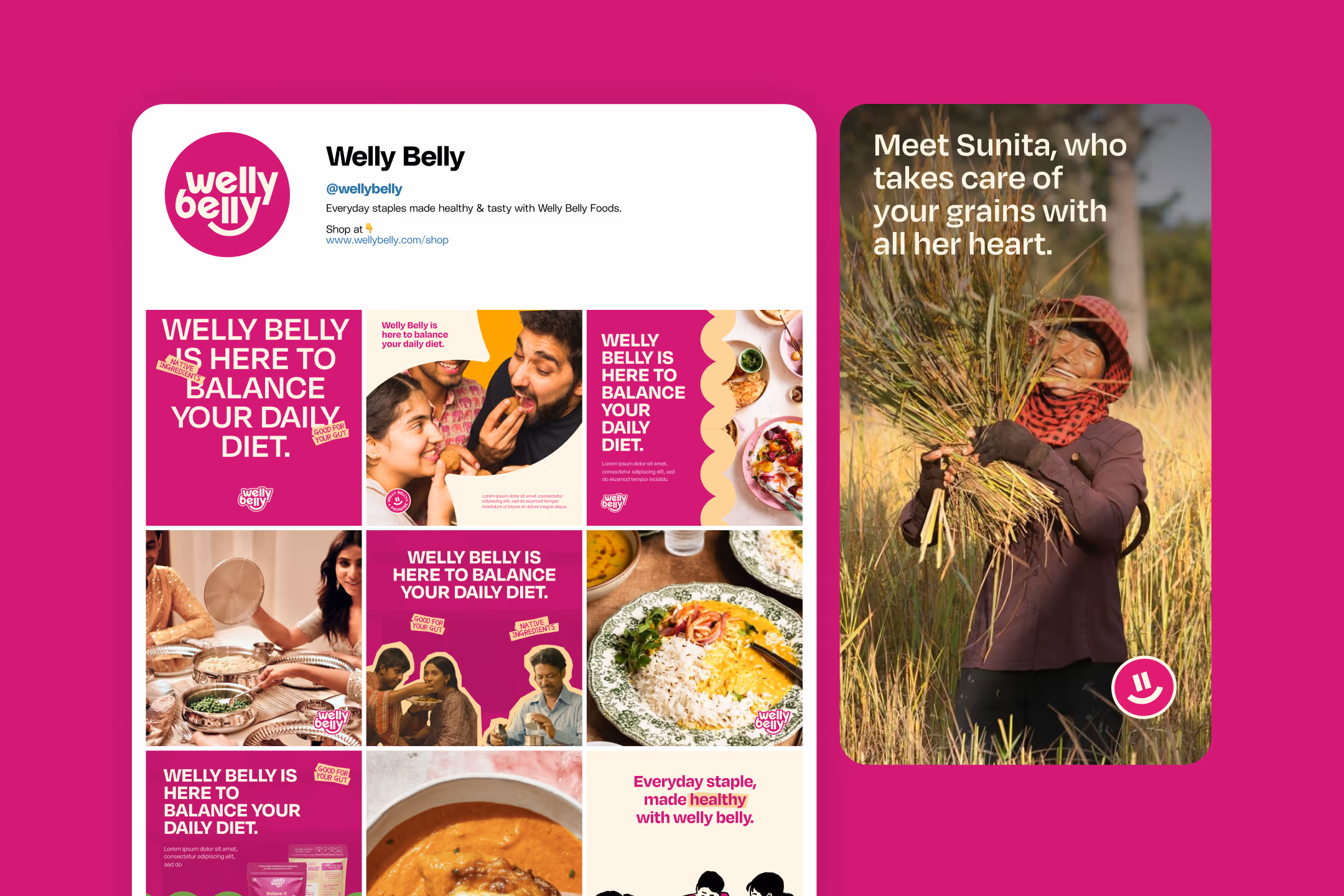
Wellness on the Web,
Welly Belly Style
Welly Belly’s website was designed to bring clarity, warmth, and intent to every scroll. We built a mobile-first, conversion-optimised platform that not only sells products, but also builds trust in the brand’s everyday philosophy.
The interface is deliberately clean, with just the right amount of color, motion, and interaction. Product pages prioritise readability—with clear benefits upfront, supporting facts below, and a consistent visual language that mirrors the packaging. We integrated educational content like Welly Belly Factly and recipe pages to foster deeper engagement and repeat visits.
Navigation is intuitive, the content hierarchy sharp, and the experience frictionless—from landing to checkout. Every detail—from hover animations to blog banners—reinforces the brand’s tone: confident, helpful, and health-first, without sounding clinical.
The result is a website that does more than function—it feels familiar, trustworthy, and uniquely Welly Belly from top to footer.


The Impact
From D2C traction to repeat purchases, Welly Belly has carved a strong niche in India’s modern pantry. Early customers cite taste and trust as the two biggest reasons for staying. Influencers, nutritionists, and retailers took note of its clear messaging and refreshing design.The visual identity—especially the vibrant pink—has become a recall asset across digital and physical touchpoints.
Looking to build a health-first FMCG brand for today’s India?
Let’s talk.Team
User research: Vrinda Gupta
Graphic design & Illustration: Vrinda Gupta, Anshul Gupta, Afeef Khan, Tanmay Acharya
Packaging models: Afeef Khan, Riya Waykar, Murtaza Dhilawala, Sandra George, Netra Ajjampur
Copywriting: Devargh Mukherjee, Vrinda Gupta, Kashish Choudhary
Creative direction: Abhishek Durani
Website development: Studio Muki, Akash Nagpal